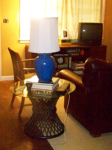
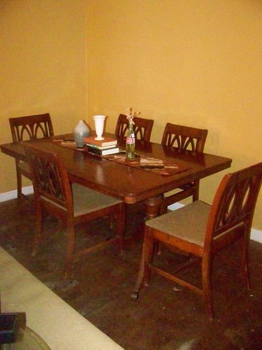
So in the last entry of our living room saga, it took us a couple of tries to find a paint color we really liked. The winning entry was Martha Stewart's Burlap, color matched to Sherwin Williams paint. Yay! And in this post you'll see it. In each photo it looks a little different. That's appropriate, because it looks different depending on the time day. The sample was a medium beige, but over the course of the day you can really see the yellow undertones...except for when you see the orange undertones. It really warms the room up and makes it look glow-y and light filled, which is awesome in this cave. Now we move on to furniture.
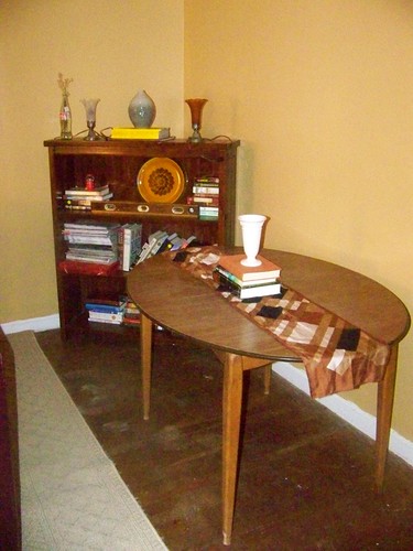
This is a picture of our dining room table.
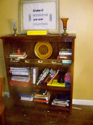
Jeremy thinks it looks sad, but I love the bones of this table. I do love a good oval table, and the construction of this piece is so mid-century modern, with its tapered little blonde legs. (That bookshelf, by the way, is a veteran of “Tracie likes to rearrange furniture.” In time we've lived in this house its been 1. In the master bedroom 2. In the kitchen 3. Flat against the wall 4. At this weird angle... I really thought it looked good like this when we moved it there a couple of weeks ago. ) I've been planning on redoing the top...for about three years. It's original issue wood-grained Formica which hasn't aged well.
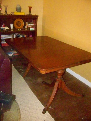
When my parents were looking to off-load a Duncan Phyfe dining set I said yes, yes, please. As much as I love mid-century pieces in general (be they modern or modest) forties furniture was super hot when I was kid visiting antiques meccas like the (late and much lamented) Lakewood Antiques Show, and so in my mind forties furniture equals sophisticated and grown up.
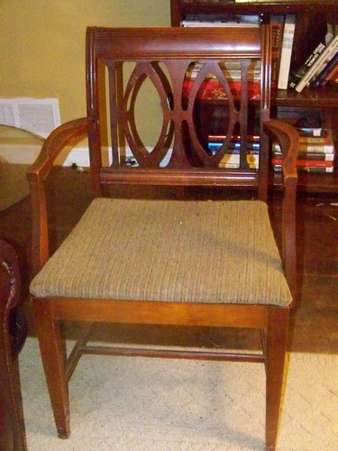
I did fear it might be a little traditional looking for the rest of our furniture. The table is classically Duncan Phyfe, which means its almost neo-classical in design. The chairs...well, quite frankly, they are entirely made of awesome. One thing I really like about Phyfe's chair designs is that they are fairly low. This helps the whole set read as more modern than higher backed chairs, which read as more traditional. And the design of these chairs! Usually Phyfe chairs have harpsicord backs or other traditional styles.
These backs actually look rather mid-century, I think. They even remind me of other super famous MCM mid-level furniture like Broyhill Brasilia (you are still my dream, Brasilia! One day we will be together! And if our being together takes the form of a dresser or credenza, that would be entirely awesome! Ahem.).
After pushing the traveling bookcase back against the wall, I moved the dining room table into position.
Hahaha. This table is so much bigger than our old one it is ridiculous. Next step was to move the bookcase. Naturally. So it went to live against the long wall by the sofa...at least for now.
Then I moved the sofa up. Much, much better. (Don't you love our sad television? It's not even hooked up! Our good tv is in the bedroom, because that's the kind of classy people we are.)
This allowed the table room to breathe. So I propped it with the vintage scarf which I'd used as a table runner on our old table (here it looks really, really small), some books and a couple of favorite vases. And we can't forget the super sophisticated Coca-cola bottle! I love the shape, and I keep meaning to paint it...I'll put it on the master list. The chairs look so great! It came with six chairs, but the arm chair is currently by the sofa because of space issues.
As much as I love the chairs, I'm pretty excited about changing out the upholstery. That tweed isn't really my thing.
After living with this (for, um, a little over twelve hours) I'm a little conflicted. Not about the dining set...I love that. More about space issues and room function. When we moved in we considered making this room a dining room/library with dining furniture, some shelves, and a comfy armchair or two and turning The Room of Horrors (our spare room) into a living room. I really think this is what I want to do. I'm going to give it a week. And then I'll have to give it another month, because that's how long it'll take me to deal with The Room of Horrors (every time I think this I imagine the movie preview guy reading it like its a new horror movie. It amuses me.).
And the former table? It's been moved into the kitchen, where its serving as an island of sorts.
So...anyone do some major furniture upgrading over the weekend?
Wednesday, September 5, 2012
Saturday, September 1, 2012
Making Mistakes
Picking paint colors is hard. Very hard. Way harder than it looks. My first post about the living room referred to the slight battle over color palate that occurred in Chez JTE. Blue-gray, said Tracie. Saturated bold color, said J. (Okay, really he said "I want it cozy! Like a cave!)
Our solution was to grab every paint chip that slightly appealed to either of us. After taping a few to the walls, I conceded that J might-might-have a point. Our little home is light filled...except for the living/dining room. The lovely double window actually gets very little light because of the porch roof over it. Add in the window treatments (a term I despise) needed for privacy (lots of tourists on our street who probably don't want to see The T&J Show when they walk past) and the room loses even more light. The light colors I favored looked dingy and dull in our natural light starved room, while Jeremy's dark colors made it look moody, sophisticated purposeful.
Looking at pictures like this one tilted me towards the dark and dramatic side.
True confession, I despise our dark leather sofa. It came with my husband, whom I do love, so I put it up with it. I love how in the dark walls absorb the dark sofa and make the whole room look so well thought out and sophisticated.
I also fell for this picture.
It's just so dramatic and rich looking.
So off we went to Home Depot, where we picked up a tester of Martha Stewart's Chocolate Truffle. Oh. My. God.
This is the sample. Yes, it looked this bad. No, actually, it looked worse. Why did I take the picture from that insane angle? No idea. The paint transformed our living space into where light came to die. And instead of absorbing the sofa...it was like the sofa won! It took over my entire living room.
We lived with it for awhile, as J at first wanted to defend its qualities (cavelike doesn't, really, qualify as a plus, bless his heart). At the end, he had to admit it wasn't working. So we primed over the chocolate splotches (lesson learned, paint on poster board from now on). It took awhile and some more samples but we finally settled on Martha Stewart's Burlap colormatched to Sherwin Williams.
We paid for our own paint and have no affiliation with Sherwin Williams, so this is a totally unbiased review, but I loved this paint! It was so creamy and we had no drips. Zero. Nada. And the coverage, considering old walls and fairly deep color, was amazing. I can't recommended it enough. Loved it. Looking forward to their next sale so we can buy some more paint!
This is still a fairly deep color, but it looks fantastic with our dark brown leather sofa. It's exactly what I wanted chocolate truffle to do.
So picking paint colors...sometimes the second time is the charm.
Our solution was to grab every paint chip that slightly appealed to either of us. After taping a few to the walls, I conceded that J might-might-have a point. Our little home is light filled...except for the living/dining room. The lovely double window actually gets very little light because of the porch roof over it. Add in the window treatments (a term I despise) needed for privacy (lots of tourists on our street who probably don't want to see The T&J Show when they walk past) and the room loses even more light. The light colors I favored looked dingy and dull in our natural light starved room, while Jeremy's dark colors made it look moody, sophisticated purposeful.
Picture from Desire to Inspire |
True confession, I despise our dark leather sofa. It came with my husband, whom I do love, so I put it up with it. I love how in the dark walls absorb the dark sofa and make the whole room look so well thought out and sophisticated.
I also fell for this picture.
From here |
It's just so dramatic and rich looking.
So off we went to Home Depot, where we picked up a tester of Martha Stewart's Chocolate Truffle. Oh. My. God.
This is the sample. Yes, it looked this bad. No, actually, it looked worse. Why did I take the picture from that insane angle? No idea. The paint transformed our living space into where light came to die. And instead of absorbing the sofa...it was like the sofa won! It took over my entire living room.
We lived with it for awhile, as J at first wanted to defend its qualities (cavelike doesn't, really, qualify as a plus, bless his heart). At the end, he had to admit it wasn't working. So we primed over the chocolate splotches (lesson learned, paint on poster board from now on). It took awhile and some more samples but we finally settled on Martha Stewart's Burlap colormatched to Sherwin Williams.
We paid for our own paint and have no affiliation with Sherwin Williams, so this is a totally unbiased review, but I loved this paint! It was so creamy and we had no drips. Zero. Nada. And the coverage, considering old walls and fairly deep color, was amazing. I can't recommended it enough. Loved it. Looking forward to their next sale so we can buy some more paint!
This is still a fairly deep color, but it looks fantastic with our dark brown leather sofa. It's exactly what I wanted chocolate truffle to do.
So picking paint colors...sometimes the second time is the charm.
Labels:
house,
living room,
mistakes,
paint colors
Subscribe to:
Posts (Atom)
Blog Love
Browse
- art (6)
- bathroom (5)
- bedroom (5)
- budget (2)
- cats (2)
- cooking (2)
- DIY (10)
- diy action squad (4)
- dogs (3)
- easy projects (2)
- food (6)
- foyer (1)
- genealogy (1)
- hall (1)
- house stalking saturdays (5)
- how-to (1)
- inspiration (1)
- lamps (1)
- life (12)
- lila (4)
- living room (15)
- marriage (1)
- mistakes (2)
- money matters (4)
- paint colors (3)
- pictures (1)
- projects (2)
- spare room (1)
- stuff I like (2)
- super affordable (6)
- that didn't go as planned (1)
- thrift store shopping (2)
- to do list (2)
- vintage (10)
- windows (4)